Rethinking Product IA
2020 - Lead Product Designer at Docplanner
As a Lead Product Designer, my role was to spearhead a comprehensive overhaul of our platform's user experience. With the platform rapidly expanding in complexity and functionality, a focused effort was required to ensure seamless integration and navigation of its features, enhancing the overall user experience.

Project Overview
Our platform's growth brought about a pressing need to address emerging challenges. These included broken workflows, inconsistency in user experience, and the necessity of tutorials for feature activation. The project's objective was to rethink the information architecture and provide a clear, intuitive structure that would foster a smoother user journey.
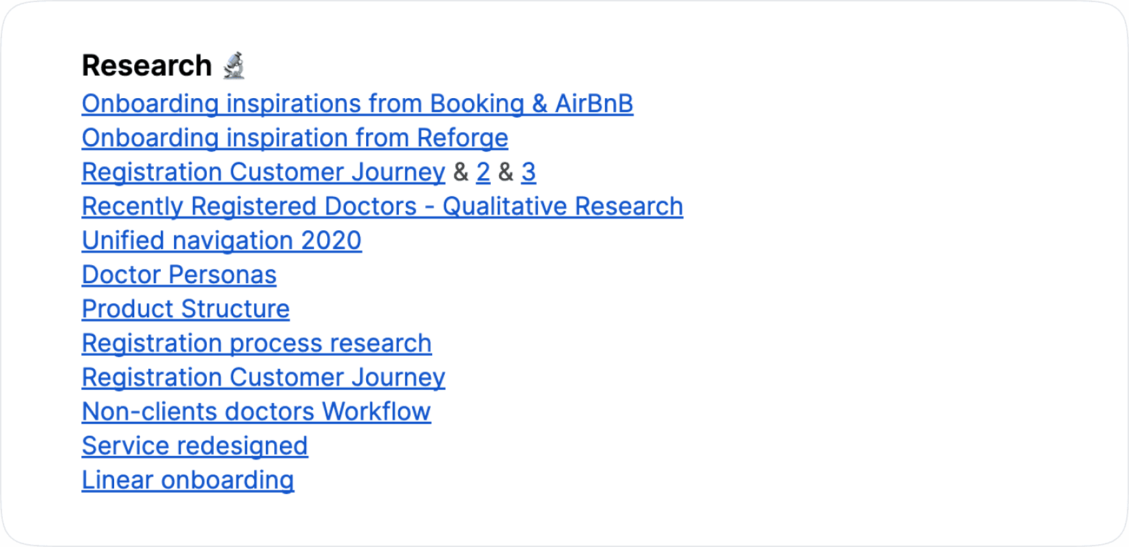
User Research
Extensive research formed the foundation of our approach. We drew inspiration from successful products like Booking and Airbnb. Customer journey analyses, doctor personas, and thorough evaluations of the existing product structure equipped us with valuable insights into user behavior and preferences.
Approach
Recognizing the multifaceted nature of the challenges, we divided the project into three main tracks: rethinking product IA, rethinking settings IA, and rethinking onboarding and wizards. To address these challenges, we adopted a two-fold approach:
Design Sprint for Product IA: A comprehensive Design Sprint enabled us to reimagine the architecture, addressing broken workflows, zigzag experiences, and inconsistency in UX. This intensive collaboration culminated in optimal solutions.
Slack Sprint for Settings and Onboarding: A continuous iteration approach using Slack ensured consistent refinements of the settings page and onboarding processes.
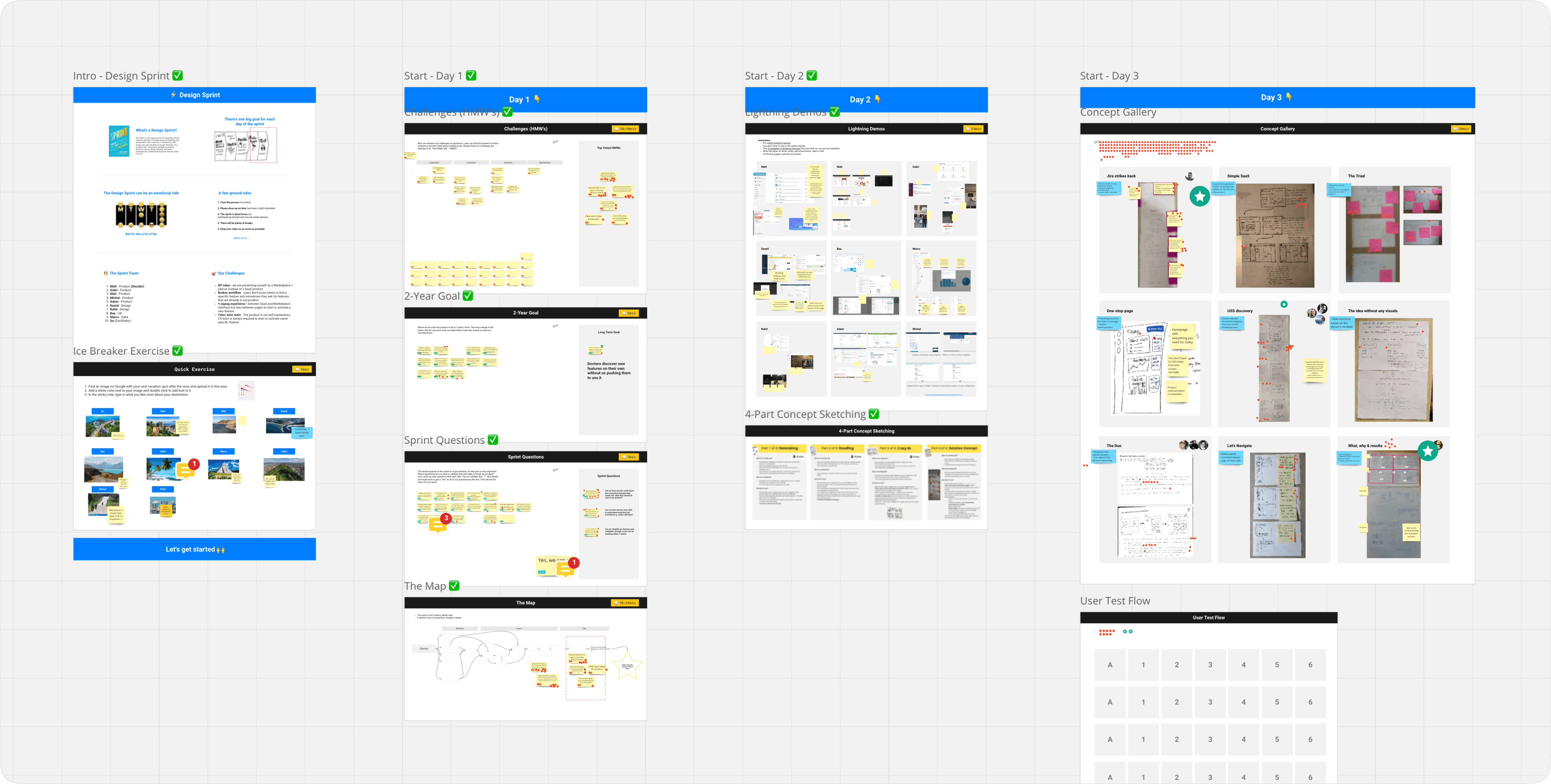
Ideating, Wireframes, & Prototyping
The ideation phase involved brainstorming innovative solutions for a cohesive user experience. We created wireframes that depicted the new navigation structure, emphasizing key features. Prototyping enabled us to visualize the flow and interactions, translating our ideas into tangible representations.
Visual Design
Visual design breathed life into our wireframes and prototypes. A consistent and intuitive visual language was established, promoting ease of use and comprehension. The redesigned platform featured a simplified navigation system and a clear visual hierarchy that guided users through the interface.
Usability Testing
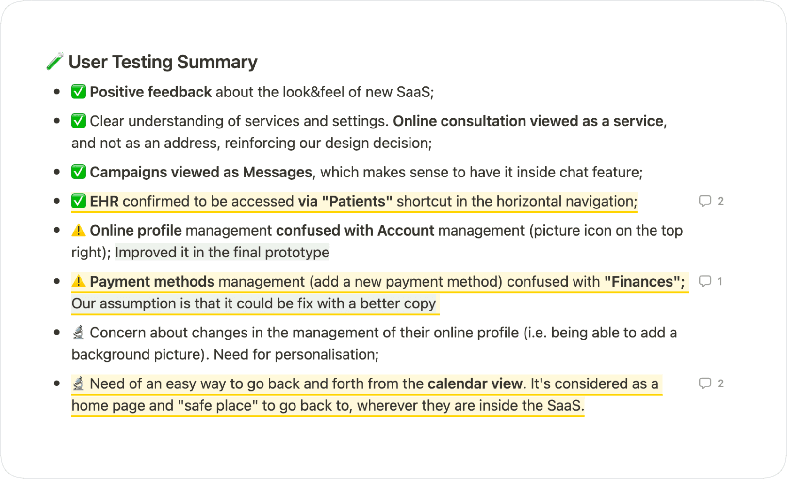
A crucial step was subjecting our prototypes to rigorous usability testing. This phase confirmed our design decisions and identified areas for improvement. Valuable insights were gathered regarding users' understanding of services, settings, online consultations, and navigation pathways.
Outcomes and Results
The meticulous efforts invested in the "Rethinking Product Information Architecture" project yielded transformative outcomes that redefined our platform's user experience. Through a comprehensive approach that encompassed research, design sprints, user testing, and refinement, we successfully addressed complex challenges and achieved significant enhancements. The following section details the tangible results that emerged from this endeavor.
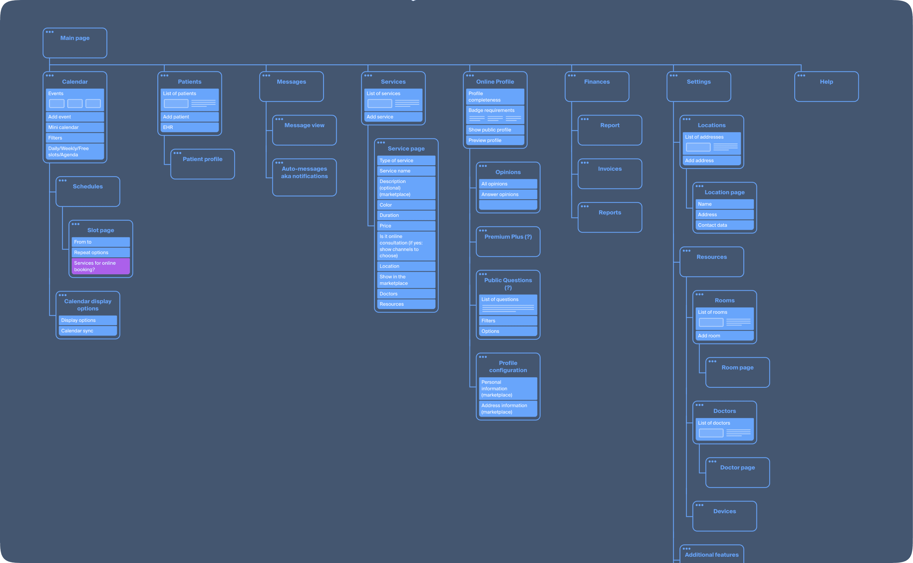
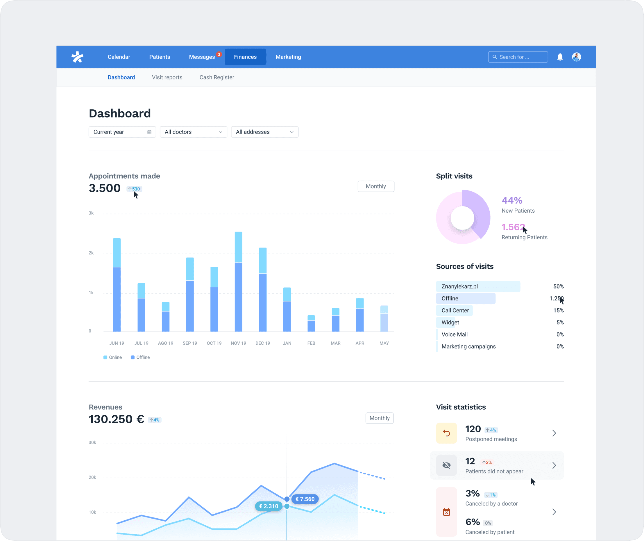
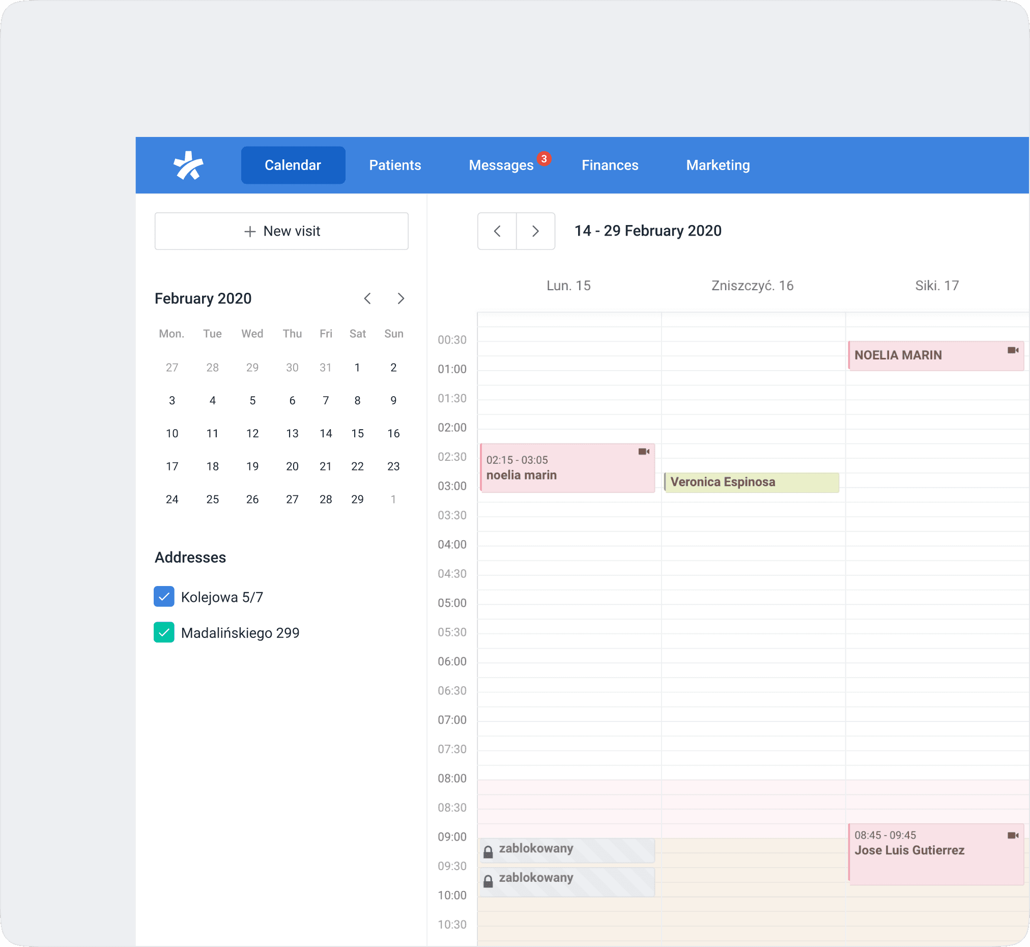
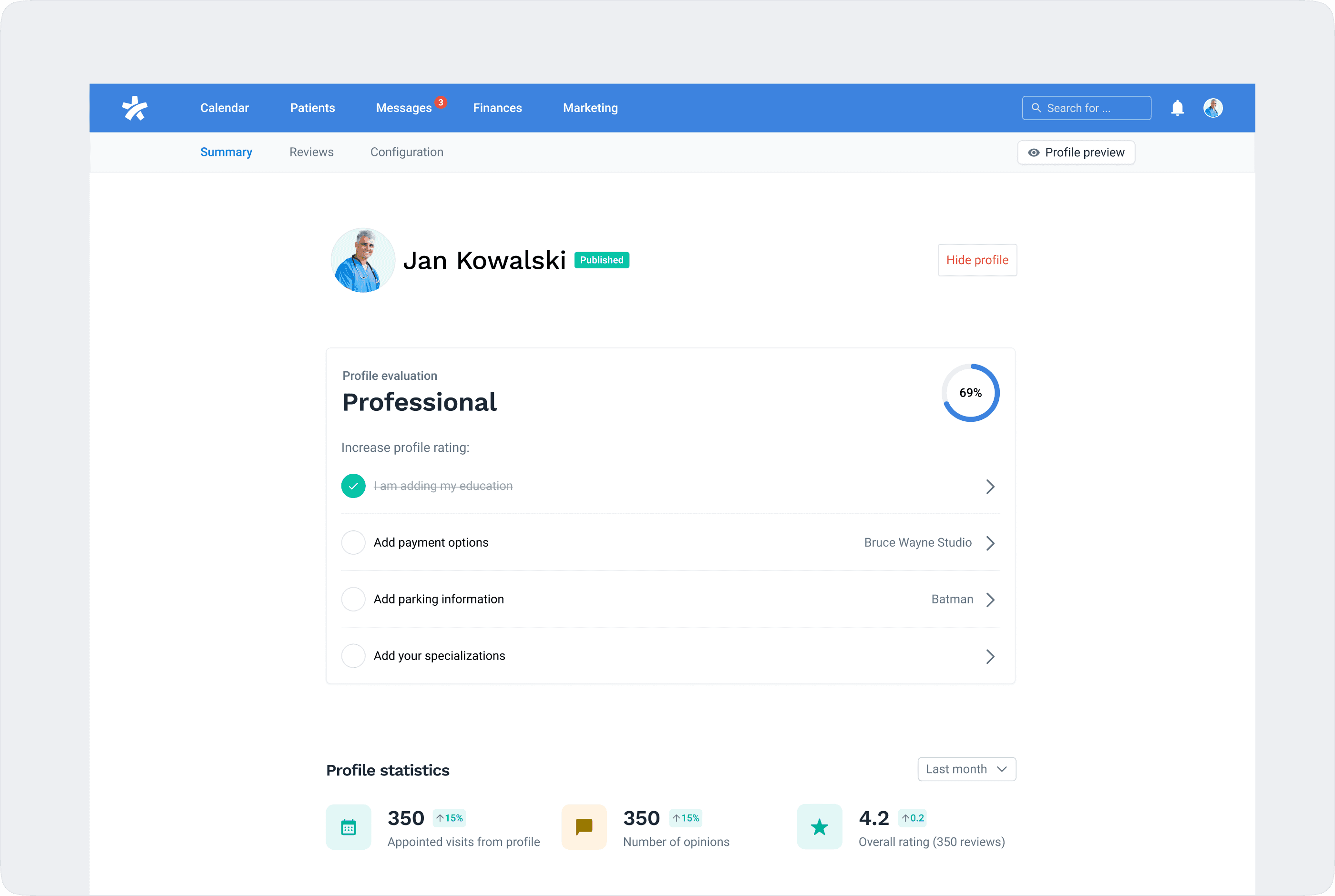
Simplified Navigation 🧭: We reorganized the navigation slightly with the idea that users should grasp the product's essence solely by reading the navigation. The main features on our platform will include Calendar, Messages, Patients, and Finance. On the right side of the navigation, you will have access to Global Search, Notifications, Online Profile, Settings, Help Area, and Log out.
Location, Service, Schedule 🤯: These components will be given equal prominence, as it aids in covering the most common flows (such as altering service prices, durations, adding services, and adjusting schedules). A wizard or guided flow will be utilized to incorporate new locations.
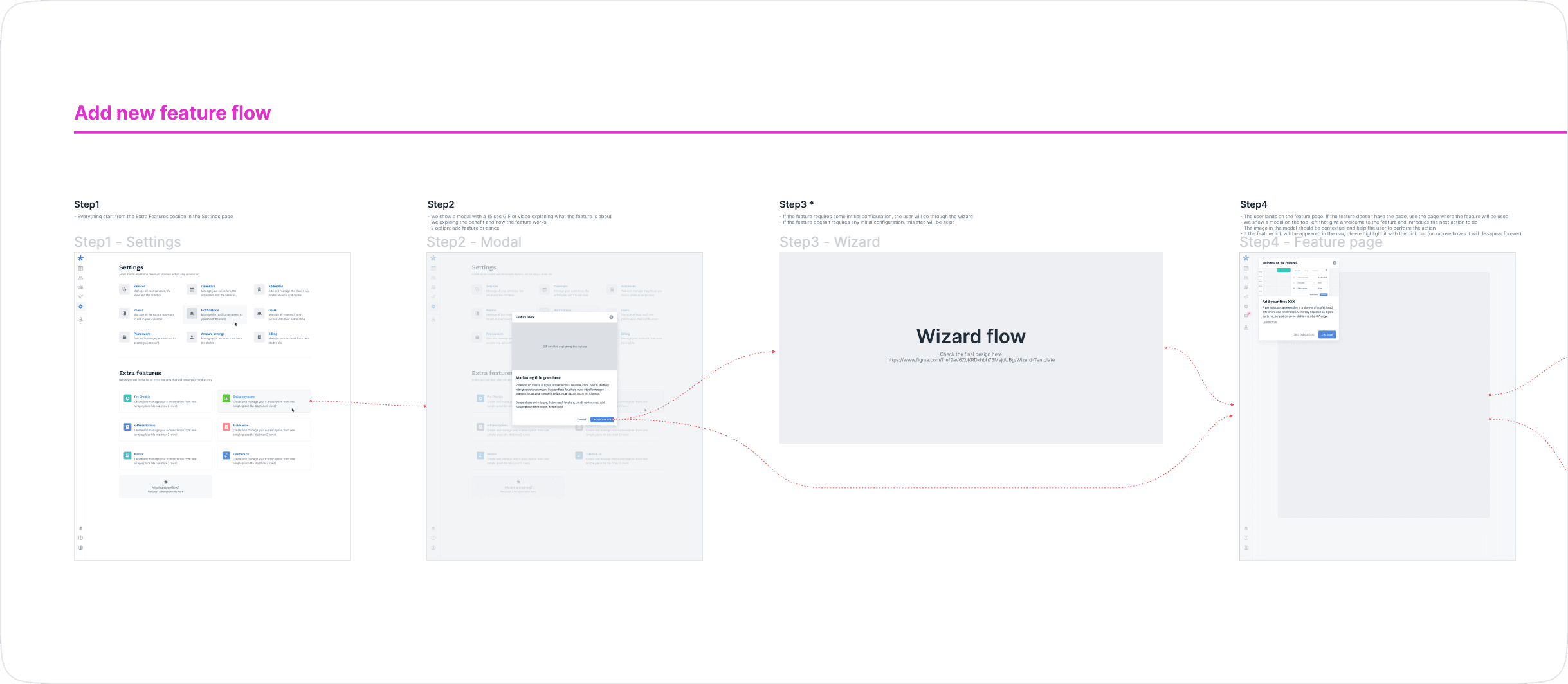
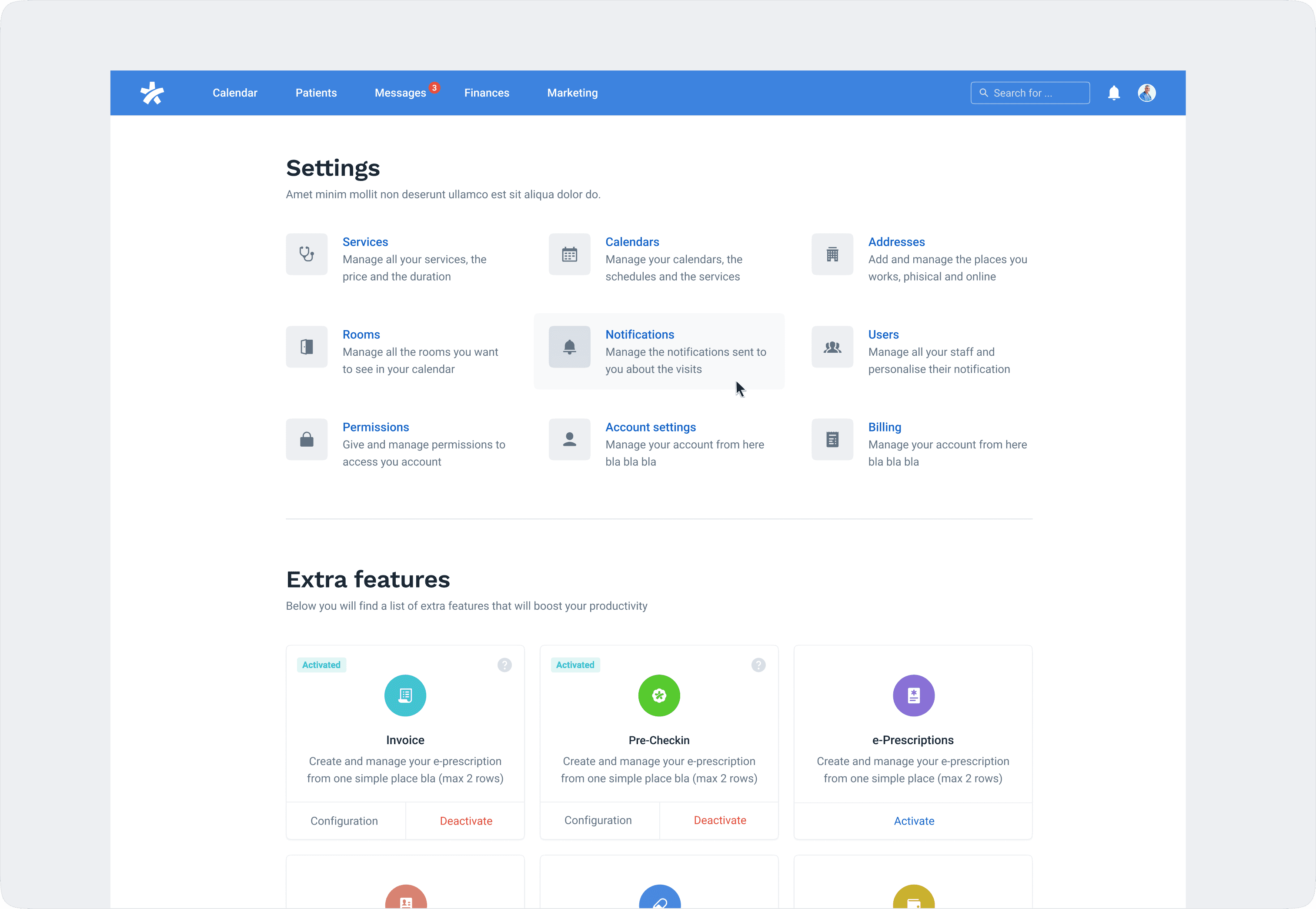
Additional Features 🎁: We bid farewell to apps, plugins, and other similar concepts. The sprint's notion is to equip the product with core features, allowing users to add supplementary features as desired. Features like websites, widgets, and pre-checking will be accessible through settings.
One-Settings ⚙️: A unified settings hub will house all settings, mirroring the Shopify approach.
Context Explanation: What, Why & Results 🧐: It is crucial to provide context for every feature, especially when user action is required. Clarify what the feature is, explain why the user needs to engage with it, and outline the resulting benefits.
Video Consultation 📹: Video consultation will be integrated as one of several service channels. On the services page, users can decide whether a service will be provided via video or other channels. This can be done by simply checking a checkbox—there's no need to activate or create anything separately (the default tool will be used).
Distinct Online Profile 🌟: The online profile will be separated from general settings. It's a vital feature that won't be hidden within the settings page.
Feedback Loop 💬: Feedback integration will be a core aspect of the product. Every page should feature a component allowing users to rate and provide feedback.
We discussed additional ideas that we postponed to a different time:
Freemium Plan
Custom Onboarding
Next Best Actions
Knowledge Base
Conclusion
The "Rethinking Product Information Architecture" project marked a milestone in enhancing our platform's usability and coherence. Through meticulous research, custom design sprints, and iterative refinement, we successfully addressed complex challenges, ensuring a seamless user experience. The project's outcomes align with our long-term goal of enabling doctors to explore and utilize platform features autonomously, positioning us as leaders in the industry.
Project Overview
Our platform's growth brought about a pressing need to address emerging challenges. These included broken workflows, inconsistency in user experience, and the necessity of tutorials for feature activation. The project's objective was to rethink the information architecture and provide a clear, intuitive structure that would foster a smoother user journey.
User Research
Extensive research formed the foundation of our approach. We drew inspiration from successful products like Booking and Airbnb. Customer journey analyses, doctor personas, and thorough evaluations of the existing product structure equipped us with valuable insights into user behavior and preferences.
Approach
Recognizing the multifaceted nature of the challenges, we divided the project into three main tracks: rethinking product IA, rethinking settings IA, and rethinking onboarding and wizards. To address these challenges, we adopted a two-fold approach:
Design Sprint for Product IA: A comprehensive Design Sprint enabled us to reimagine the architecture, addressing broken workflows, zigzag experiences, and inconsistency in UX. This intensive collaboration culminated in optimal solutions.
Slack Sprint for Settings and Onboarding: A continuous iteration approach using Slack ensured consistent refinements of the settings page and onboarding processes.
Ideating, Wireframes, & Prototyping
The ideation phase involved brainstorming innovative solutions for a cohesive user experience. We created wireframes that depicted the new navigation structure, emphasizing key features. Prototyping enabled us to visualize the flow and interactions, translating our ideas into tangible representations.
Visual Design
Visual design breathed life into our wireframes and prototypes. A consistent and intuitive visual language was established, promoting ease of use and comprehension. The redesigned platform featured a simplified navigation system and a clear visual hierarchy that guided users through the interface.
Usability Testing
A crucial step was subjecting our prototypes to rigorous usability testing. This phase confirmed our design decisions and identified areas for improvement. Valuable insights were gathered regarding users' understanding of services, settings, online consultations, and navigation pathways.
Outcomes and Results
The meticulous efforts invested in the "Rethinking Product Information Architecture" project yielded transformative outcomes that redefined our platform's user experience. Through a comprehensive approach that encompassed research, design sprints, user testing, and refinement, we successfully addressed complex challenges and achieved significant enhancements. The following section details the tangible results that emerged from this endeavor.
Simplified Navigation 🧭: We reorganized the navigation slightly with the idea that users should grasp the product's essence solely by reading the navigation. The main features on our platform will include Calendar, Messages, Patients, and Finance. On the right side of the navigation, you will have access to Global Search, Notifications, Online Profile, Settings, Help Area, and Log out.
Location, Service, Schedule 🤯: These components will be given equal prominence, as it aids in covering the most common flows (such as altering service prices, durations, adding services, and adjusting schedules). A wizard or guided flow will be utilized to incorporate new locations.
Additional Features 🎁: We bid farewell to apps, plugins, and other similar concepts. The sprint's notion is to equip the product with core features, allowing users to add supplementary features as desired. Features like websites, widgets, and pre-checking will be accessible through settings.
One-Settings ⚙️: A unified settings hub will house all settings, mirroring the Shopify approach.
Context Explanation: What, Why & Results 🧐: It is crucial to provide context for every feature, especially when user action is required. Clarify what the feature is, explain why the user needs to engage with it, and outline the resulting benefits.
Video Consultation 📹: Video consultation will be integrated as one of several service channels. On the services page, users can decide whether a service will be provided via video or other channels. This can be done by simply checking a checkbox—there's no need to activate or create anything separately (the default tool will be used).
Distinct Online Profile 🌟: The online profile will be separated from general settings. It's a vital feature that won't be hidden within the settings page.
Feedback Loop 💬: Feedback integration will be a core aspect of the product. Every page should feature a component allowing users to rate and provide feedback.
We discussed additional ideas that we postponed to a different time:
Freemium Plan
Custom Onboarding
Next Best Actions
Knowledge Base
Conclusion
The "Rethinking Product Information Architecture" project marked a milestone in enhancing our platform's usability and coherence. Through meticulous research, custom design sprints, and iterative refinement, we successfully addressed complex challenges, ensuring a seamless user experience. The project's outcomes align with our long-term goal of enabling doctors to explore and utilize platform features autonomously, positioning us as leaders in the industry.