Introducing Stuart’s Design System
2018-2019 - Senior Product Designer at Stuart
Stuart is a B2B delivery platform and on-demand logistics solutions for all kinds of businesses. Our mission is to design and build innovative solutions to help our clients grow. Keirin is our design system, created with the express intention to help accomplish this mission.
And where did the name come from? Find out here. Since we’re big fans of cycling, and moving quickly — it felt like a natural choice! 🚴 💨

Why it was time for a new system
In 2018, Stuart hit a tipping point and experienced exponential growth. The plan for 2019 is incredibly demanding for all the squads and we have to release multiple products and many important product features. Therefore, in mid-2018, we decided to create the Stuart Design System to help us design and develop our products as quickly and efficiently as possible.
One of the major problems we have faced historically with design is that a lot of sketch files and UI components were not in-sync with the developed products. This happened because different parts of various products were designed by different designers at different times, without clear and unifying design guidelines or principles to follow.
This became a huge scalability problem which we felt was holding us back 😓
New complex products and features have to be released as soon as possible, and too much time can be wasted in debating design decisions during the implementation stage.
Based on all the considerations, we defined the design and business goals we wanted to achieve with the project:
Enormous time-saving for design and developers;
Improve team communication;
Increase the consistency in design, code, and brand;
Increase the quality of our products;
Scalability;
Implement accessibility guidelines.

The challenge ahead
Creating a design system is super-challenging for several reasons.
It requires resources and time;
It’s not always clear what a design system actually is;
It requires a huge collaboration between the development and the design teams;
It’s an investment of time up front that takes time away from ongoing product development.
We had a lot of questions to ask ourselves as we began working on Keirin:
How do we build the design system without adding inconsistency to our products?
How do we convince management that a design system can bring value to the business?
And, crucially, how do we make it so the design UI kit can be synchronised with the components developed?

Bringing Keirin to life
We approached this project using the Atomic Design Methodology by Brad Frost and planned a 3-stage roadmap.
One of the biggest mistakes that small design teams can do is to implement a total redesign because most of the time it will end up in huge projects that require months of development time.
We chose to start by consolidating all the UI already developed, reducing the distance between design and development and only after that improve or redesign only the components that need it.
Roadmap:
Consolidation (✔ done)
Documentation (✔ done)
Improvement (⇦ we are here)

Stage One > Consolidation
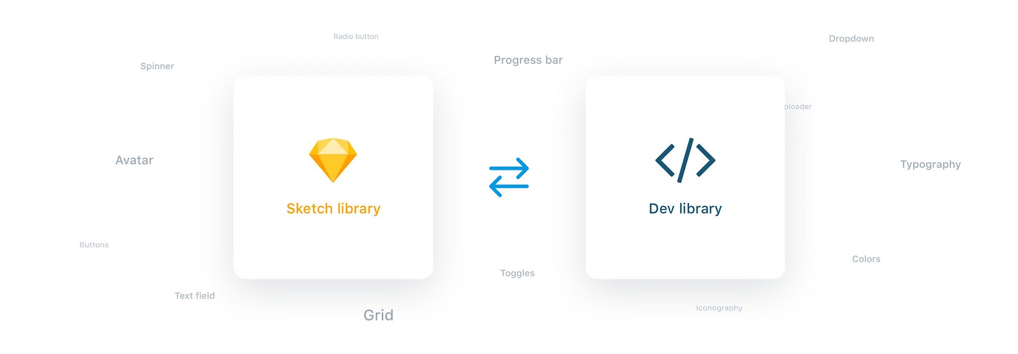
With our Front-End and Mobile teams we’ve listed all the atoms used (desktop and mobile), analysed the differences and updated the sketch files to match perfectly with the atoms that were already developed.
We opted to update the sketch files instead of updating the already-developed atoms so that we could use them immediately for new projects and avoid adding inconsistencies to the system.
Stage Two > Documentation
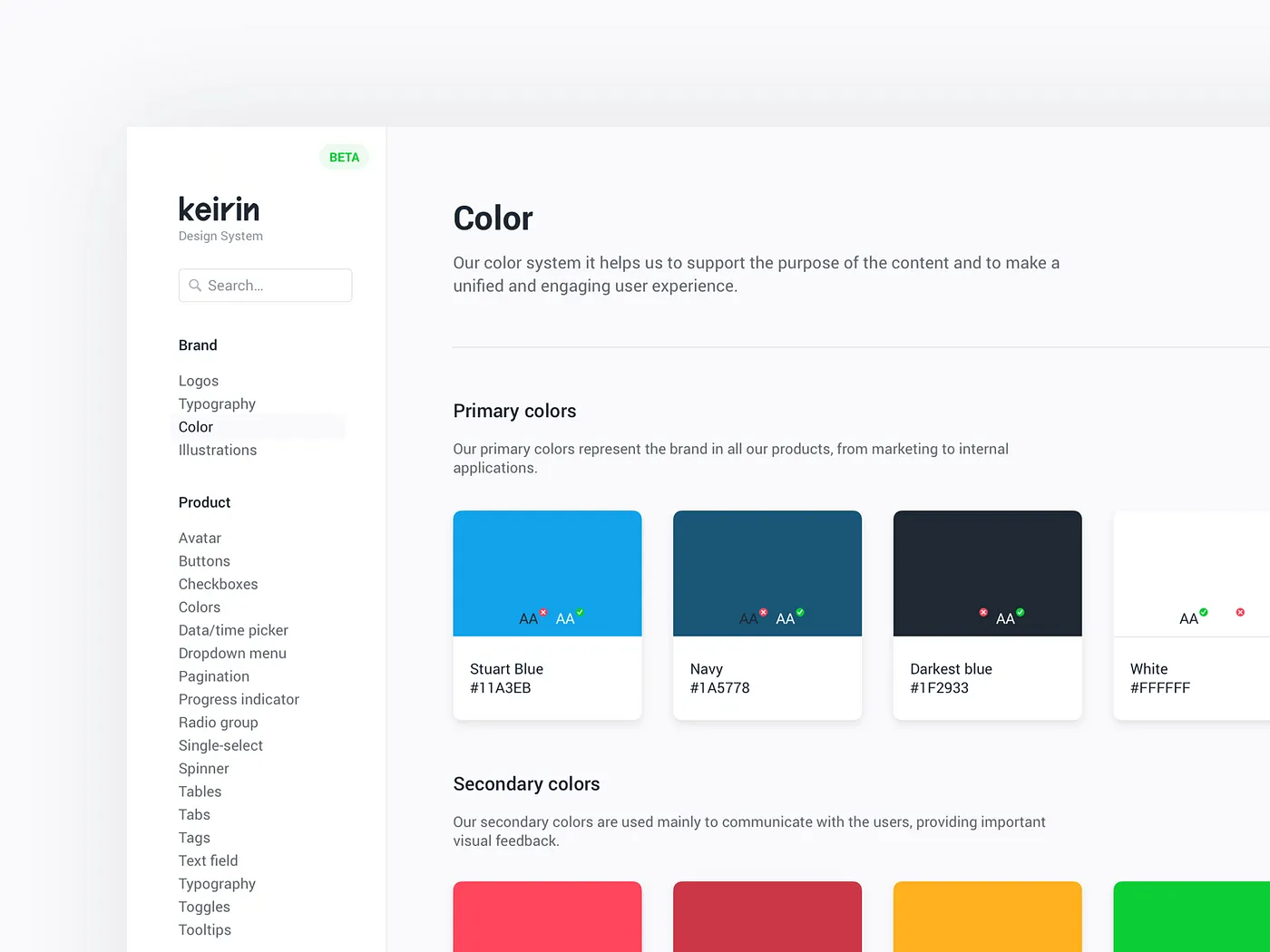
With all the atoms aligned and synced with the live products, we moved to the second stage: write the documentation. This stage helps us to deeply analyse all the components and understand which components were fine or which ones needed improvements or a complete redesign.
When the documentation was ready we developed the Keirin Website to collect all the atoms (along with the documentation and guidelines) to make it accessible to everyone in the company.
Stage Three > Improvements
So, what’s next?With all the components synced and with clear documentation online, it is now time to focus on each component and really give it some love ❤️This is an ongoing process that consists of improving/redesigning components, adding new ones, and making our design system as complete and flexible as possible.Focusing on style guide delivery as the climax is the wrong story to tell. A system isn’t a project with an end, it’s the origin story of a living and evolving product that’ll serve other products. — Nathan Curtis
It’s just the beginning…We have grand plans for Keirin during the rest of the year. We’ll be working hard to improve it and make it the tool that will help us speed up our process and increase the products quality.
I hope you enjoyed this case study! We can’t wait to make Keirin public and share it with the wider design community 🙌
Why it was time for a new system
In 2018, Stuart hit a tipping point and experienced exponential growth. The plan for 2019 is incredibly demanding for all the squads and we have to release multiple products and many important product features. Therefore, in mid-2018, we decided to create the Stuart Design System to help us design and develop our products as quickly and efficiently as possible.
One of the major problems we have faced historically with design is that a lot of sketch files and UI components were not in-sync with the developed products. This happened because different parts of various products were designed by different designers at different times, without clear and unifying design guidelines or principles to follow.
This became a huge scalability problem which we felt was holding us back 😓
New complex products and features have to be released as soon as possible, and too much time can be wasted in debating design decisions during the implementation stage.
Based on all the considerations, we defined the design and business goals we wanted to achieve with the project:
Enormous time-saving for design and developers;
Improve team communication;
Increase the consistency in design, code, and brand;
Increase the quality of our products;
Scalability;
Implement accessibility guidelines.

The challenge ahead
Creating a design system is super-challenging for several reasons.
It requires resources and time;
It’s not always clear what a design system actually is;
It requires a huge collaboration between the development and the design teams;
It’s an investment of time up front that takes time away from ongoing product development.
We had a lot of questions to ask ourselves as we began working on Keirin:
How do we build the design system without adding inconsistency to our products?
How do we convince management that a design system can bring value to the business?
And, crucially, how do we make it so the design UI kit can be synchronised with the components developed?

Bringing Keirin to life
We approached this project using the Atomic Design Methodology by Brad Frost and planned a 3-stage roadmap.
One of the biggest mistakes that small design teams can do is to implement a total redesign because most of the time it will end up in huge projects that require months of development time.
We chose to start by consolidating all the UI already developed, reducing the distance between design and development and only after that improve or redesign only the components that need it.
Roadmap:
Consolidation (✔ done)
Documentation (✔ done)
Improvement (⇦ we are here)

Stage One > Consolidation
With our Front-End and Mobile teams we’ve listed all the atoms used (desktop and mobile), analysed the differences and updated the sketch files to match perfectly with the atoms that were already developed.
We opted to update the sketch files instead of updating the already-developed atoms so that we could use them immediately for new projects and avoid adding inconsistencies to the system.

Stage Two > Documentation
With all the atoms aligned and synced with the live products, we moved to the second stage: write the documentation. This stage helps us to deeply analyse all the components and understand which components were fine or which ones needed improvements or a complete redesign.
When the documentation was ready we developed the Keirin Website to collect all the atoms (along with the documentation and guidelines) to make it accessible to everyone in the company.

Stage Three > Improvements
So, what’s next?With all the components synced and with clear documentation online, it is now time to focus on each component and really give it some love ❤️This is an ongoing process that consists of improving/redesigning components, adding new ones, and making our design system as complete and flexible as possible.Focusing on style guide delivery as the climax is the wrong story to tell. A system isn’t a project with an end, it’s the origin story of a living and evolving product that’ll serve other products. — Nathan Curtis
It’s just the beginning…We have grand plans for Keirin during the rest of the year. We’ll be working hard to improve it and make it the tool that will help us speed up our process and increase the products quality.
I hope you enjoyed this case study! We can’t wait to make Keirin public and share it with the wider design community 🙌
Why it was time for a new system
In 2018, Stuart hit a tipping point and experienced exponential growth. The plan for 2019 is incredibly demanding for all the squads and we have to release multiple products and many important product features. Therefore, in mid-2018, we decided to create the Stuart Design System to help us design and develop our products as quickly and efficiently as possible.
One of the major problems we have faced historically with design is that a lot of sketch files and UI components were not in-sync with the developed products. This happened because different parts of various products were designed by different designers at different times, without clear and unifying design guidelines or principles to follow.
This became a huge scalability problem which we felt was holding us back 😓
New complex products and features have to be released as soon as possible, and too much time can be wasted in debating design decisions during the implementation stage.
Based on all the considerations, we defined the design and business goals we wanted to achieve with the project:
Enormous time-saving for design and developers;
Improve team communication;
Increase the consistency in design, code, and brand;
Increase the quality of our products;
Scalability;
Implement accessibility guidelines.

The challenge ahead
Creating a design system is super-challenging for several reasons.
It requires resources and time;
It’s not always clear what a design system actually is;
It requires a huge collaboration between the development and the design teams;
It’s an investment of time up front that takes time away from ongoing product development.
We had a lot of questions to ask ourselves as we began working on Keirin:
How do we build the design system without adding inconsistency to our products?
How do we convince management that a design system can bring value to the business?
And, crucially, how do we make it so the design UI kit can be synchronised with the components developed?

Bringing Keirin to life
We approached this project using the Atomic Design Methodology by Brad Frost and planned a 3-stage roadmap.
One of the biggest mistakes that small design teams can do is to implement a total redesign because most of the time it will end up in huge projects that require months of development time.
We chose to start by consolidating all the UI already developed, reducing the distance between design and development and only after that improve or redesign only the components that need it.
Roadmap:
Consolidation (✔ done)
Documentation (✔ done)
Improvement (⇦ we are here)

Stage One > Consolidation
With our Front-End and Mobile teams we’ve listed all the atoms used (desktop and mobile), analysed the differences and updated the sketch files to match perfectly with the atoms that were already developed.
We opted to update the sketch files instead of updating the already-developed atoms so that we could use them immediately for new projects and avoid adding inconsistencies to the system.

Stage Two > Documentation
With all the atoms aligned and synced with the live products, we moved to the second stage: write the documentation. This stage helps us to deeply analyse all the components and understand which components were fine or which ones needed improvements or a complete redesign.
When the documentation was ready we developed the Keirin Website to collect all the atoms (along with the documentation and guidelines) to make it accessible to everyone in the company.

Stage Three > Improvements
So, what’s next?With all the components synced and with clear documentation online, it is now time to focus on each component and really give it some love ❤️This is an ongoing process that consists of improving/redesigning components, adding new ones, and making our design system as complete and flexible as possible.Focusing on style guide delivery as the climax is the wrong story to tell. A system isn’t a project with an end, it’s the origin story of a living and evolving product that’ll serve other products. — Nathan Curtis
It’s just the beginning…We have grand plans for Keirin during the rest of the year. We’ll be working hard to improve it and make it the tool that will help us speed up our process and increase the products quality.
I hope you enjoyed this case study! We can’t wait to make Keirin public and share it with the wider design community 🙌