Freelancer — 2017–2018
UX, consistency, and a Mobile Pattern Library at Freelancer.com
In Sydney, Australia, I worked as a Product Designer for Freelancer. By researching, analyzing data, and testing different solutions, I worked with talented people to improve the platform's user interface and user experience. Additionally, I created a Mobile Pattern Library with the mobile engineers in order to improve the quality of the mobile products and save time during implementation.
Starting point
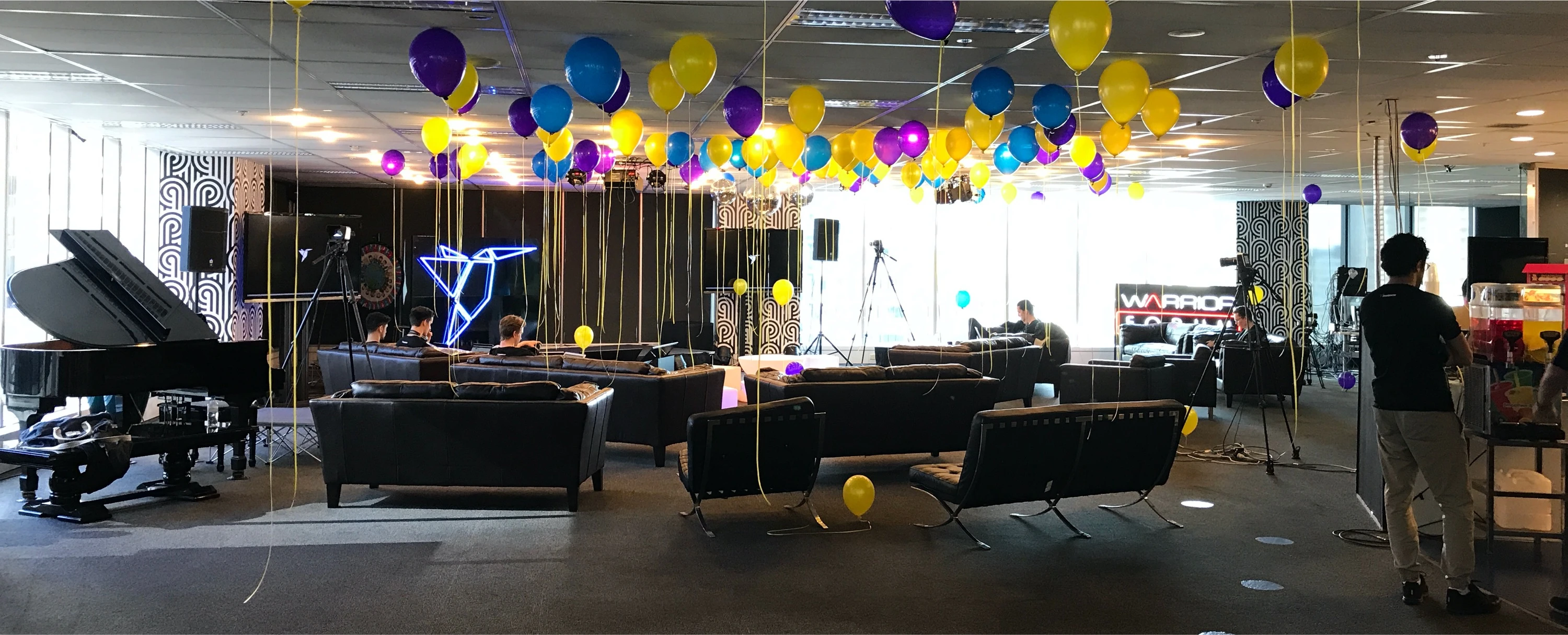
Freelancer.com is the world's largest freelancing and crowdsourcing marketplace. It connects over 31 million employers and freelancers globally. I joined the Company as the Product Designer and worked on multiple projects with different teams, focusing on improving the user experience for millions of users.

#1 Mobile-Desktop UX inconsistency
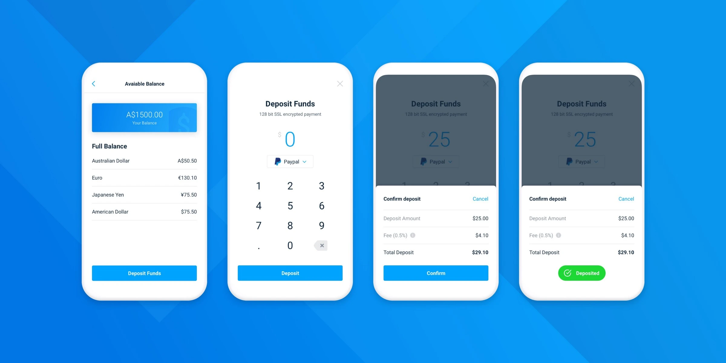
One of the main problems the management wanted to solve was the inconsistency between the web and the native apps in terms of UX. Posting a project, awarding a freelancer, managing payments — they were completely different experiences, and sometimes users got confused when moving from one device to another.
Solving the user experience inconsistency was a challenging project, because changing how users are used to performing some actions can have a negative impact on their experience and on business metrics. With the Product Manager and the whole team we decided to approach it gradually, to help the user get used to the new changes and to measure and be sure they didn't affect the metrics negatively.
I started by digitally mapping the entire mobile experience and comparing the inconsistent experience with the web platform. Then with the Product Manager and the Data Scientist we chose where to focus our work and came up with a product strategy. It wasn't one-way — some of the good mobile user experiences were tested and implemented on the desktop app too.
I followed the full design process: researching, checking the data, and exploring how to provide the best solution to reach our goal. I made sure all the changes were user-tested before starting implementation, and even after we were A/B testing the changes and following the data results, iterating on them when needed.
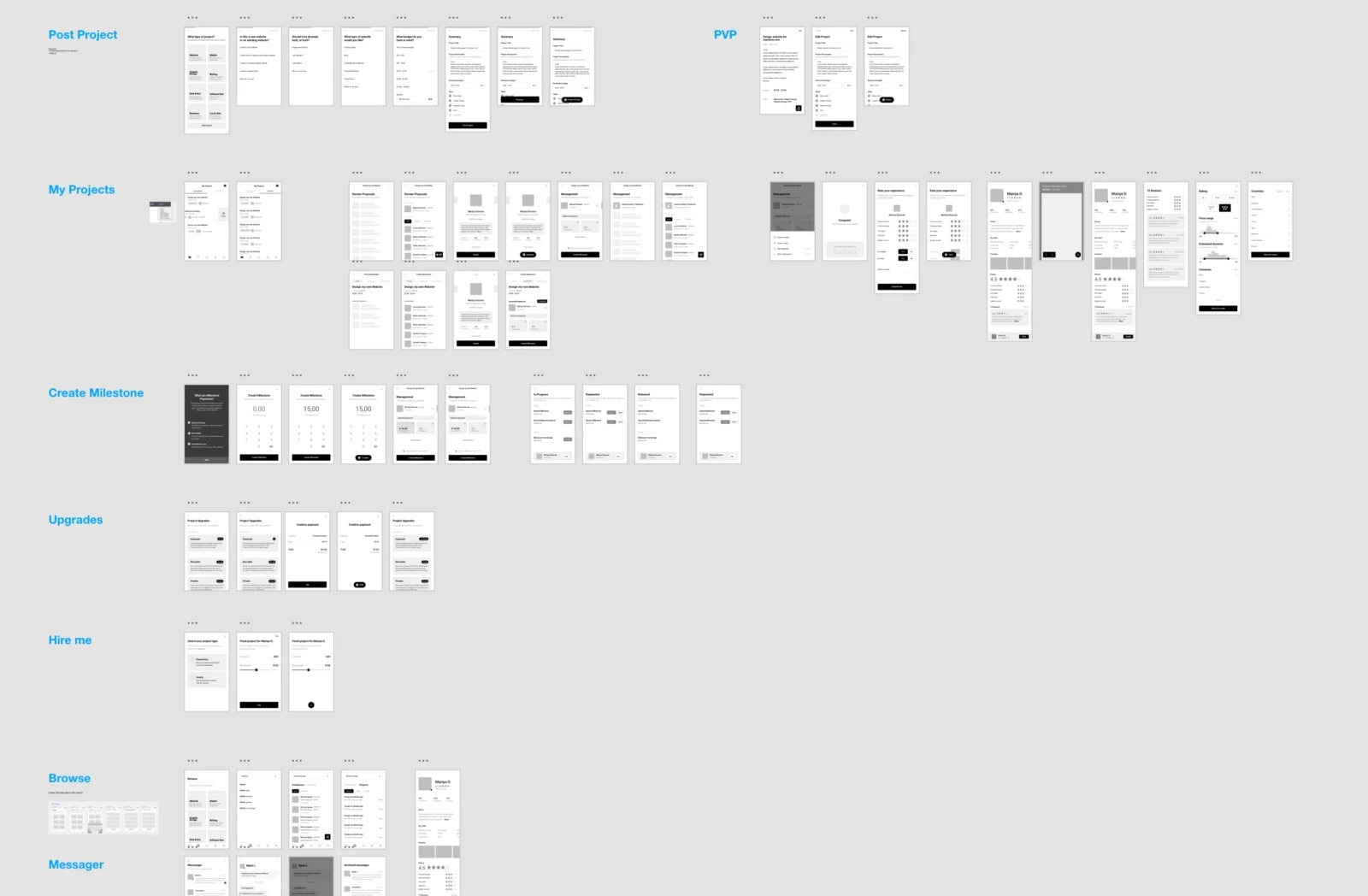
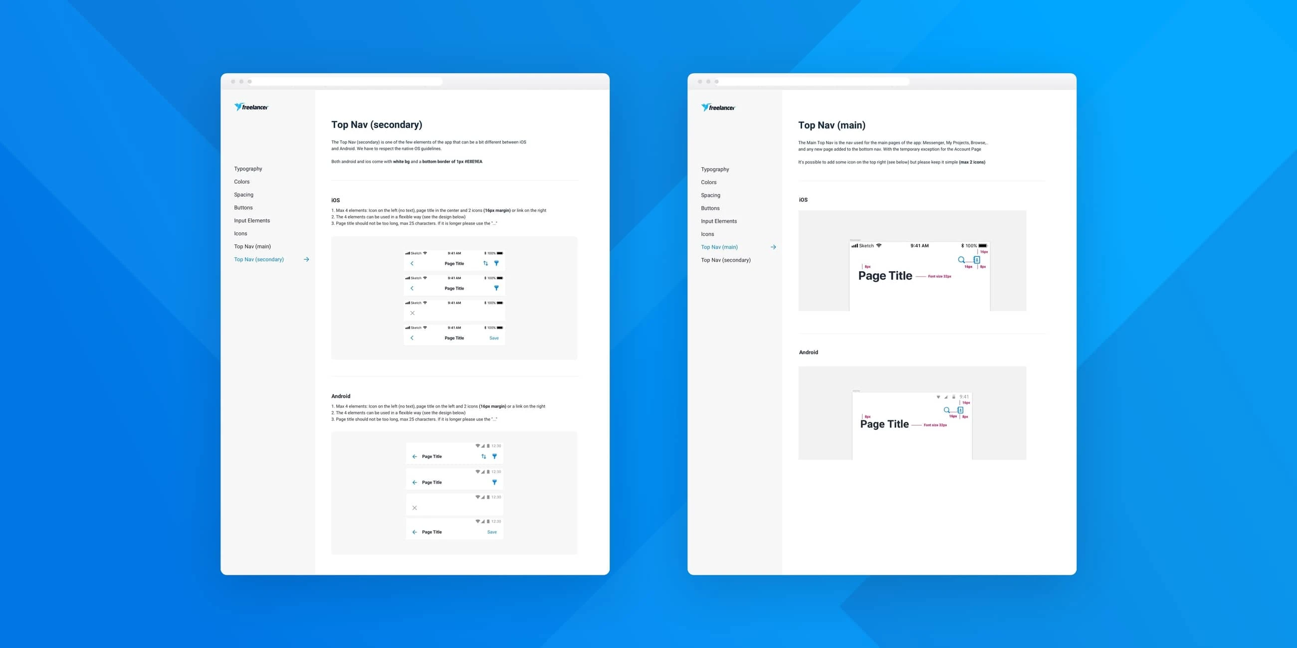
#2 Mobile UI Pattern Library
Another big problem the management wanted to tackle was the inconsistency in terms of User Interface between the native, mobile web and desktop versions of the product.
"The platform on mobile seems from another company"
"The app doesn't respect our brand guidelines"
"Even between the Android and the iOS app there is inconsistency in the UI"
So with the design and mobile engineering teams we decided to standardise some guidelines and write documentation that could help mobile developers and designers be more aligned and reduce UI inconsistency.
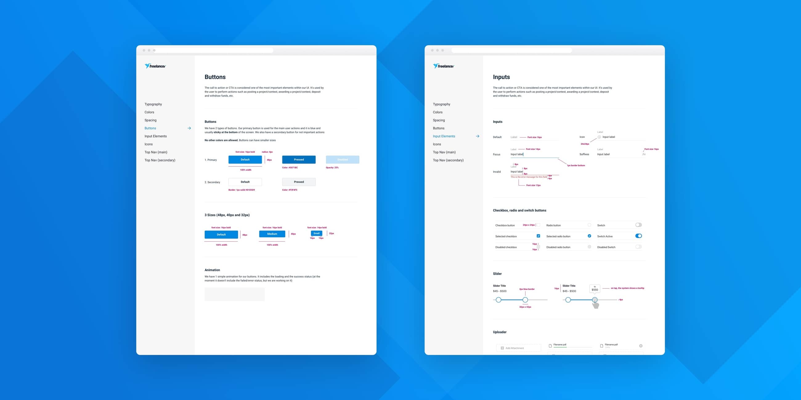
I led this project and worked with 4 great mobile engineers (2 iOS and 2 Android) and the design team. We approached it following the Atomic Design Methodology by Brad Frost and started documenting all the differences between the desktop and the mobile UI. After analysing them we saw where the main inconsistencies were and focused on those UI elements, improving them one by one in the Sketch library and in the live app.
As a final step we created a website available to everyone inside the company where we documented all the elements and provided guidelines on how to use them. This is important because a pattern library is not owned by one person or a team, but is a product of the whole company.
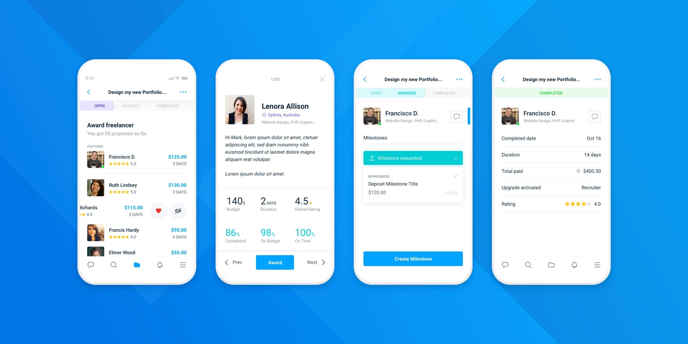
#3 Award funnel
With the Matchmaking team we worked on some incredible new features to improve the life of our clients and freelancers. One of the problems we found from user interviews and data analysis was that it was not very easy to browse and choose the right freelancer.
"The page is overwhelmingly"
"The filters are not helpful"
"I don't know which freelancer I should award"
We brainstormed, researched and explored different ideas. After a few months of work, prototypes and user testing sessions we were super excited about the design solution we arrived at. We approached this problem from 3 different sides: cleaning the page from unnecessary information, redesigning the filter system, and releasing a new feature — the Expanded Bid Card.
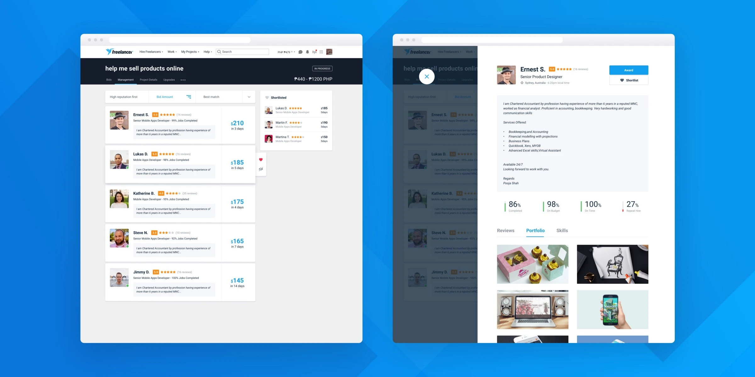
👆 Removing unnecessary elements from the page would help the user focus on the goal of the page and reduce the feeling of overwhelm.
✌️ Providing an advanced and redesigned filter system would improve the user experience of our clients when browsing and filtering the freelancers most appropriate for their projects.
🤟 Providing an Expanded Bid Card with all the most important information about the freelancer would help reduce the number of clicks and time spent, and help the user stay on the same page without having to open each freelancer profile.
We also thought about mobile and provided a solution for it too. We made sure to gradually implement the changes and measure them through A/B testing. The feedback and metrics were incredibly positive.
And much more...
These are just 3 of the many projects I had the opportunity to work on during my 2 years at Freelancer HQ in Sydney. It was a great experience that helped me grow a lot and learn new skills. 🚀